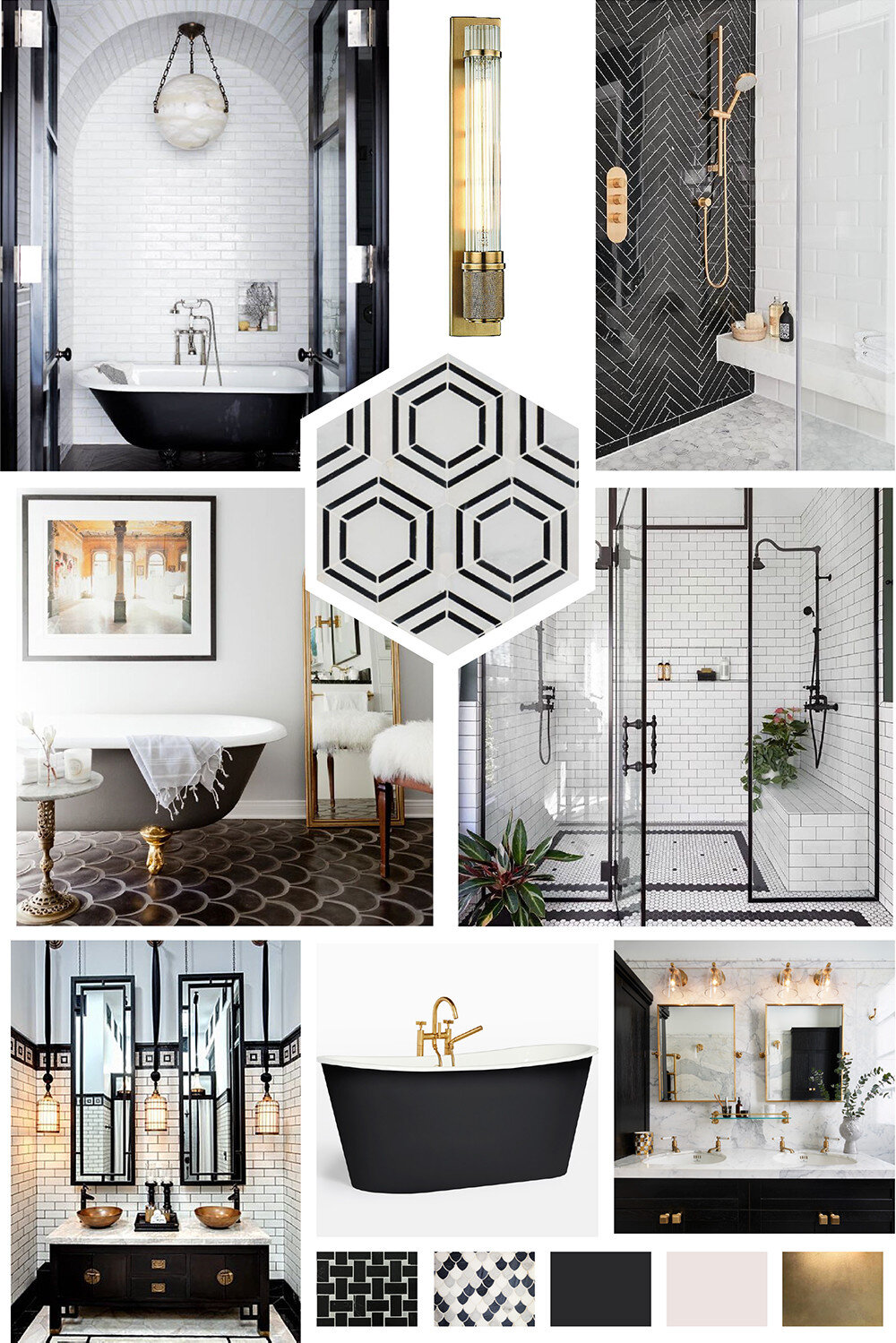
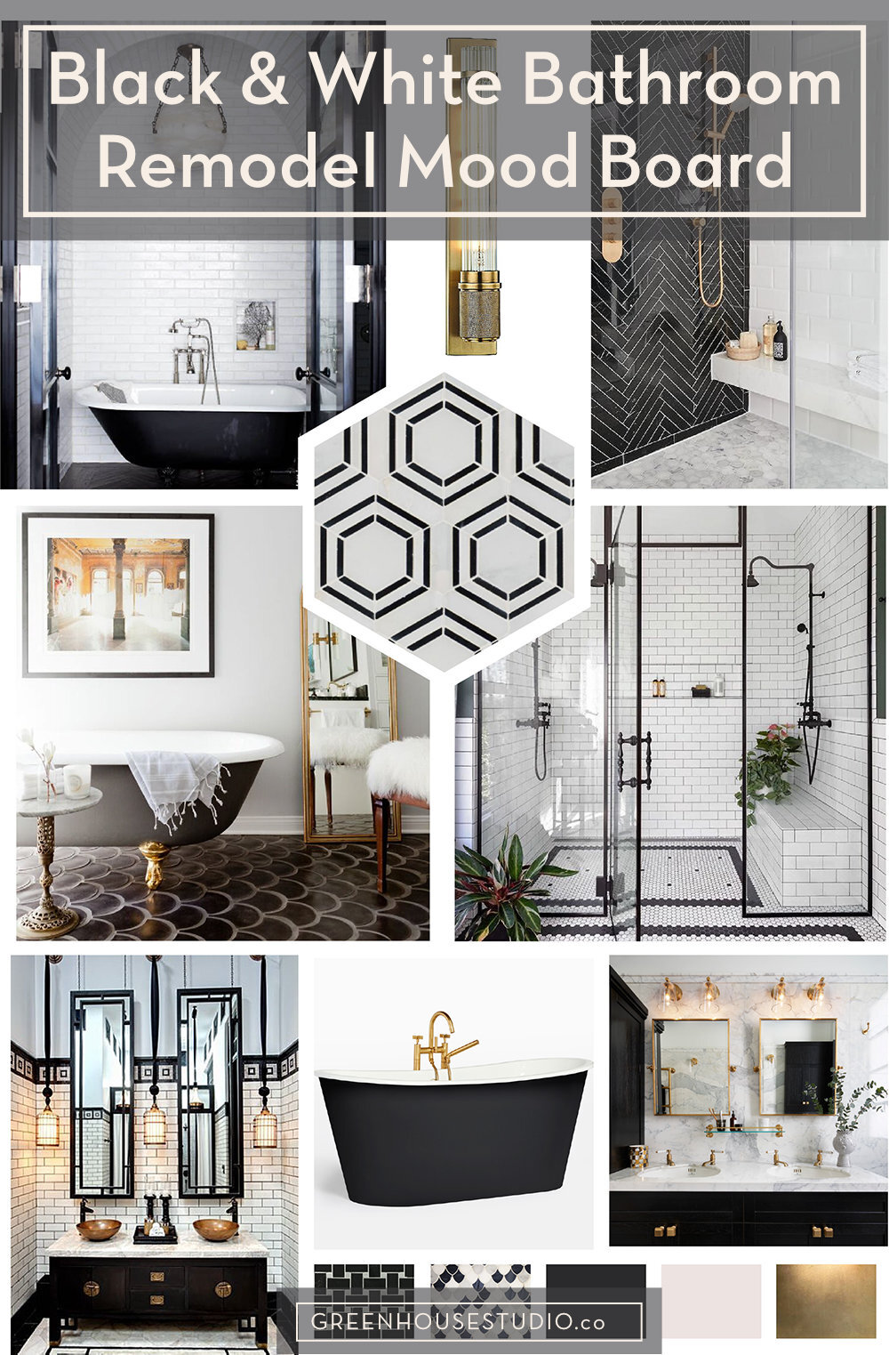
Black and White Bathroom Mood Board
Today I’m bringing you a mood board renovation project that has been top of mind for many years now - my hallway bath. This poor bathroom has been in desperate need of a facelift for many years now. Many decades would be more accurate.
I decided a while back that this bath would be in some version of black and white. Black and white bathrooms (and black and white rooms in general) kept popping up on my Pinterest boards. I had a pre-conceived idea that I wanted color, and at one point some years back, a lot of color, but the Pinterest boards don’t lie, and I realized black and white for me manages to be both stimulating and restful as well as timeless.
Whether you’re into black and white bathrooms or not, take a look because it can be helpful to see someone else’s process of curating a mood board in preparation for a remodel or any design project.
[This post contains affiliate links. Click here to read my full disclosure.]
Mood board created using Adobe Illustrator. Imagery from top to bottom, left to right: elledecor.com, Lumens, Ali Budd Interiors, hex tile - Home Depot, Rosa Beltran Design, @michelledirkse & by @aaronleitz via Instagram, Siam Hotel, Rejuvenation, Drummonds.
Black and white bathroom ideas
If you’re contemplating a remodel project yourself, I recommend reading my post on Creating An Interior Design Mood Board. I discuss having a “springboard” inspiration object or image. This is something that serves as an inspo-driving force behind your design ideas.
For this bathroom project, my springboard image has been a fabulous bathroom designed by Rosa Beltran Design. I’ve been ogling these pics for a few years now and have them saved across Insta and Pinterest.
I love everything about this design but I especially can’t get enough of those black fish scale tiles by Arto in Los Angeles. I love the all the details too, from the mirror casually propped against the wall reflecting art deco style sconces to the photo print of a crumbling palace in Havana. (I have similar prints myself of crumbling palace fabulousness, so I may flat-out steal this idea!)
Rosa recently re-posted this image and said of all her work, this is by far the most popular on social media, so apparently I’m not the only star-struck one.
Rosa Beltran’s black and white bathroom is my main inspiration image for my own bathroom remodel. Those charcoal black fish scale tiles by Arto Tile are to die for. A dark cast-iron vintage tub is also on my list. Design | Rosa Beltran Design
[Want more design inspo and helpful plant tips? Let's hang out on Instagram!]
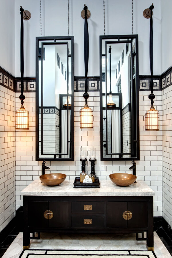
Of course now I feel I’m betraying the image below of the bathroom at the Siam Hotel in Bangkok. Also very much a springboard-inspirational vision of black and white high style for me. It wins hands down for east-meets-west, art-deco inspired fabulousness. Normally I’m allergic to drama, but in this case, sign me up!
This high drama bath never ceases to amaze - especially the elongated mirrors and fixtures suspended from what looks like black Thai silk. The black Asian credenza with brass fittings and a stone top matches the stone floor. White subway tile with black grout is bordered by a black and white tile mosaic. Siam Hotel, Bangkok.
Here’s another gorgeous, luxurious bathroom housed in an apartment building in Malta built in 1928 in an Art Nouveau style. The clients asked the architects to do a modern interpretation of Art Nouveau/Art Deco period style for the master bathroom.
The geometric floor tile creates a stunning perspective effect by using different shades of black, white, and gray marble. A beautiful black cast-iron tub with unlacquered brass fixtures and a Carrara marble wall completes the look. If I climbed into that tub, good luck getting me out!
This beautiful luxurious bath is inspired by Art Nouveau and Art Deco architecture in a circa 1928 apartment building in Malta. Design | Cuschieri Architects via Drummond’s Bathroom
Black and white baths can look expensive without being expensive
It’s also important to note that a black and white bathroom is a great candidate for using not so expensive materials and still achieving a high end, custom look.
Take a look at the two images below. Both have beautiful, vintage-style charm achieved with simple black and white. You can go to Home Depot or Lowes and source these materials inexpensively.
The trick here (and this is so often the trick) is having a great design plus skilled installation. The beautiful herringbone layout of the black ceramic tile immediately below is contrasted with classic white subway tile. These are two of the least expensive types of tile available.
Plus, I would argue this bath will never go out of style either. And there aren’t many design-styles where I would say that. This could stretch your budget even further down the road if your room doesn’t feel dated.
Get the geometric look of this black herringbone wall tile with contrasting grout and white subway tile by using inexpensive ceramic tile. Beautiful doesn’t always to have to cost a fortune! @margaretrajic @josh_the_builder @sarahmontgomerydesign via floor_creations_inc
In the kids’ bathroom below, the white shiplap looks clean and modern while maintaining a vintage charm when combined with white hex tile and dark grout. The white contrasts beautifully with the black tub and three black windows.
This black and white kids' bathroom has clean and charming style with white shiplap walls next to black framed windows and a black clawfoot bathtub on white hex tiled floors with black grout. Decor Pad
Back to dreamy, luxurious high drama, below is Coldplay guitarist Jonny Buckland’s black and white bathroom featured in Elle Decor.
The white arch is a dramatic setting for the cast-iron tub set on an ebonized herringbone floor in this black and white master bath. Design | Ashe + Leandro featured in Elle Decor
Mood board conclusions
When you finish creating your mood board, it’s important to take a step back and look at it as a whole. What designs, patterns, colors, styles etc. jump out at you?
To clarify, what do you see repeated in the mood board? Is there anything you didn’t realize was important to you until you stepped back and saw it repeated several times over once the board was done?
For me, I pretty much knew I wanted to go in a black and white direction, but where fixtures were concerned, I thought I was equally drawn to either polished nickel or unlacquered brass.
After stepping back from my own boards both in Pinterest and the one below created in Adobe Illustrator, I realized that the gold/brass tones are an element I want to include. I think it’s a beautiful contrast to both black and white surfaces. I’m sure I’ll mix in some polished nickel, but I will definitely go with some antiqued brass as well to warm things up.
Also, I’ve always been an Art Deco fan, but I’ve retreated from it in the past few years. However, after poring over my mood boards, I do want to include it as an element, but in a decidedly modern way.
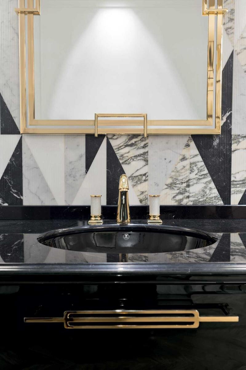
Art Deco inspired drama meets warm brass details with natural stone in this black and white luxury bath mood board inspo pic. That’s the other fun part about mood boards - you can pin whatever you want! Oasis Home & Bath
My own mood board takeaways:
Black and white (charcoal and cream may be more accurate) - yes
Unlacquered brass is a must-have alongside polished nickel for warmth
Hints of Art Deco within a modern design interpretation
Are you working on a design project of your own either big or small? Have you done a mood board yet, and if so, what did you learn? Leave me a comment below.
Other posts you’ll love:
Other posts you’ll love:
Enjoy the post? Pin it for later!


