Nature-Inspired Home Office Remodel - Plans, Mood Boards, & Progress Shots
The Greenhouse Studio home office renovation has been underway for some time. The construction part of it has been done for a while now, but the design details? Well… that usually seems to take me a bit longer to actually finish. Longer than it should take as I’m the first to admit. I’m still arranging and adjusting a few things, specifically the shelving, so I want to share how it got to this point; the before and in-progress shots, my inspo and mood boards, and plans.
I’ve actually been using it as my office for a couple months now and I love sitting in this light-filled space tapping away on the keyboard. Believe me though, when you see the “before” shots, you may share a bit of the surprise I feel at how much I enjoy the room now.
[This post contains affiliate links. Click here to read my full disclosure.]
Home office history
This room was added onto to my 1923 Spanish style home in 1950 as a bedroom for a nurse to the wife who was ill, but it’s much more like an office in layout. It’s long and narrow so it can only fit a twin bed, and it has an exterior door. It has an odd divided bathroom with shower and toilet behind a door and an open sink in a separate alcove.
The “existing” or “as-built” plans for my home office. Plan Source | Michalski Design Group
This was originally my youngest son’s room but always in desperate need of help. The door was in terrible shape and we were worried about him escaping as a toddler, so we actually just caulked it shut and it remained so until now - he’s 14.
We were on the verge of doing a significant home remodel, actually in the bidding phase, when we separated, and that was the end of those remodel plans. But having a set of my existing house plans ready to go in AutoCAD to work off of has been so useful!
As I said, it was my son’s room, but after the major earthquake Napa experienced in 2014, he never slept in there again. He packed it in and basically moved to the office-guest room room to sleep, although this room continued to be his “workshop” of sorts with his desk and a table etc. (He always has projects going on. Can’t imagine where he got that from.)
We were basically sharing the office-guest room for the past 5 plus years - my office like always, and his bedroom of sorts. I decided it was high time to figure out how to make a light renovation happen budget-wise, so he could have this room for his own.
Essentially, it was time for me to “get creative” and figure out how to make it work on a shoestring budget.
This is actually my favorite way to work. I’ve often stated that projects in certain publications-that-shall-not-be-named sometimes have a static, museum-like quality to me. I think a main reason is that they’re constructed almost without constraints - specifically, with a sky’s-the-limit budget.
I’ve always maintained that having constraints, whether structural, budgetary, regulatory, or otherwise, forces designers to get creative, and a project is usually better for it. (Read more on this and how to budget and fund a home remodel.)
Home office design process
After much pacing, contemplating, and Pinteresting, I came up with a vision. If you read my “design manifesto” on how to design a room, I talk about having a design springboard for inspiration. I was entranced by Polish artist Margo Hupert’s studio filled with light, artwork, and plants.
Source - Margo Hupert via Instagram
While the future Greenhouse Studio home office was indeed light filled - it has a wall of south-facing windows, no one would have ever called it lovely.
Other spaces that inspired me were images with an organic feel to them - what I dubbed as “studio-office-meets-greenhouse-cabinet-of-curiosities.”
Source | Raw Materials Home Store via Pinterest
There’s so much character and vintage artist-meets-gardener charm in these images. Even the walls (especially the walls?) with the exposed bricks above and the chippy concrete below - it reminds me of sycamore tree bark. It’s likely a reaction to the ever greater homogenization and cookie-cutter nature of American design and life, but I just can’t get enough of images like these.
Source | inspirationsdeco via Pinterest
So after pondering the issues with my own space, I decided that the main priorities were:
New flooring - it had much abused carpet
Wall resurfacing - this room was a poorly constructed addition with uneven and patchy surfaces
Electrical - hard-wiring an internet connection and overhead can lights for working
Door hardware - the caulk was coming off, so yes, we needed to be able to lock the door
Paint - the visual “glue” that would hopefully pull it together (check out my post on picking paint colors for the home office paint drama)
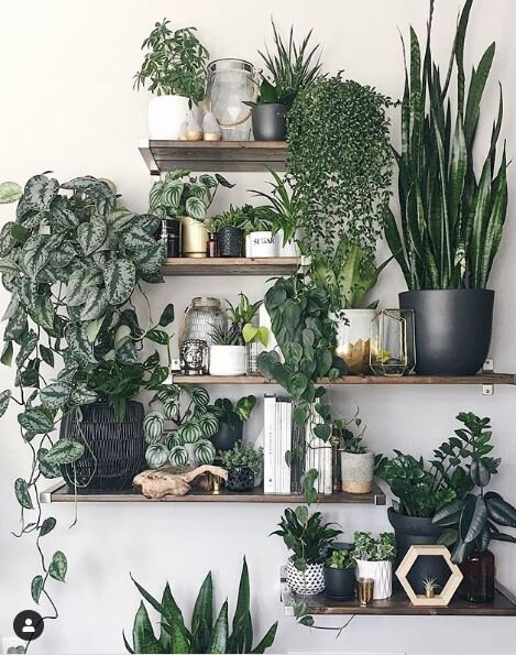
Floating shelves - I knew they would provide a great place for plants to enjoy all that sun
Source | @melissamlo via Instagram
I gathered some info on how much all of this would cost along with estimating additional costs of office furniture and a few other miscellaneous items and put it all into a simple spreadsheet I use for renovation projects.
I made choices like keeping the existing door and just replacing the hardware, even though as much as I like old doors, it could stand replacing altogether. I also decided that new window treatments could wait since I really don’t use them much anyway.
Home office design plans
As I said above, the room is very narrow and also has an odd header where the ceiling goes from the original 9’ to 8’ where a flat roof was tacked on in 1950. (This wasn’t a well though-out addition, even though the homeowner was a builder.)
The effect sort of divides the room into two areas, at least when you start thinking about furniture placement.
So I knew I wanted a large desk next to the door, and a drafting table (counter height at 36” high) for projects. I also needed to fit my vintage oak filing cabinet, a small bookcase, and I thought I might also keep my giant flat-files drawers in here to hold my landscape architectural plans.
Here’s why it’s good to always draw out your plan; once I actually laid out everything, I realized those giant flat files that can hold plans up to 36x48” were a no-go. They would have made it nearly impossible to move about, especially to get into the sink area.
What my home office would have looked like if I had used all of my original furniture ideas and dimensions. I wouldn’t have been able to walk through to the back! Always draw a layout plan and/or mark it out on the floor.
Pro-tip: You should maintain 36” of transit space in areas you’ll be walking through, and 42” is ideal. (42” is preferred by designers when planning how far to distance your kitchen island from the counter for example.)
My vision of lugging home that fabulous 60” vintage drafting table from Craigslist? Once I marked it out on the floor, (I recommend always marking out furniture on the floor too with tape in addition to drawing it) I realized that even without the flat files, the space couldn’t accommodate a table that size and also have room to move between the table and my file cabinet.
I also realized I wanted to be able to move the table easily. So the table size got scaled way down.
There’s only have 30” of walking space when making the corner to the bathroom, but it’s enough since it’s not used much.
Final furniture layout for Greenhouse Studio home office. The project table is a 30”x42” vintage style drafting table (see below) instead of a 60” table. I have 18” to stand and work between the floating shelves and the table. I also have 30” to walk into the bathroom, which isn’t ideal, but works here. The 36”x48” flat files are in the garage.
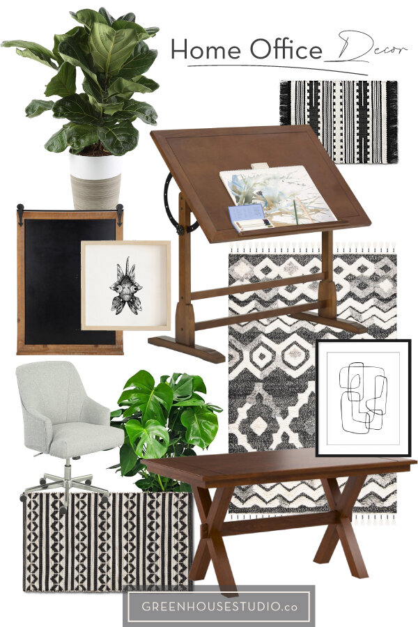
Once I had a working plan in place, it was time for the fun part - actually sourcing some of the items for the room. Take a look at my mood board I created in Adobe Illustrator .
I'm happy with the way the office design has evolved. Lots of light, dark, and green, with a good dose of vintage added in.
(Here’s a post laying out exactly how to create a mood board for interior design.)
Home office progress
Here’s a shot after the wall resurfacing and painting finished. After much paint drama, I settled on Benjamin Moore’s Paul Revere.
The walls are resurfaced and painted in Benjamin Moore’s Paul Revere wall color and Feather Down trim. (It looks much more gray in the picture than in real life.)
Here’s a sneak-peek at the Greenhouse Studio home office. Once the plants, artwork, and decor are finalized, plus a general cleanup, we’ll be good to go!
It’s almost there! Thanks for checking in, and stay tuned as I finish up and bring you the full reveal.
What kinds of home projects are you tackling? If you’re working at home, have you made improvements to your work space? Let me know in the comments below - I’d love to hear from you.
Want even more helpful design tips? Be sure to sign up below to get your free design guide so we can stay in touch!
Enjoy the post? Pin it for later!


