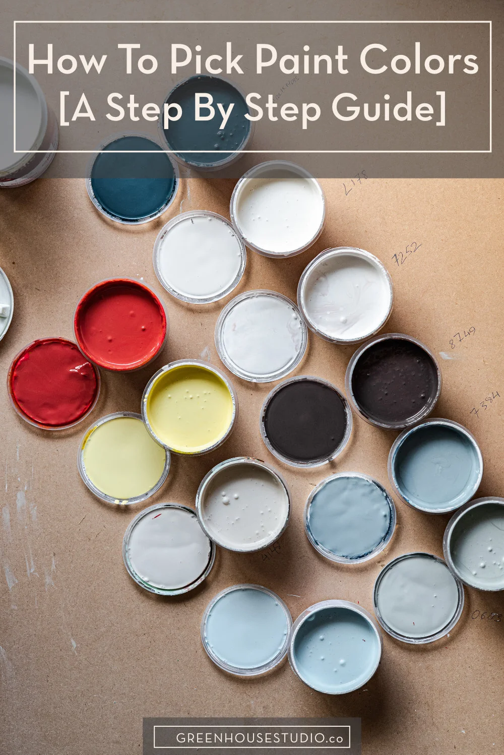
How To Pick Paint Colors For Your Home’s Interior
My interior paint project just wrapped up so I wanted to write up my experience while fresh. I’m the first to admit that choosing paint can drive me and everyone around me batty.
Painting your interior can be a simple DIY where you paint the walls and call it done, or it can be an elaborate, expensive process where painters are paid to do a significant amount of woodwork, trim, wall, and ceiling prep and paint work.
Regardless of your scope of work, choosing a paint palette is a key part of your home design, and I’ve definitely gone through my own share of trials and tribulations with it. So I want to be completely transparent about my process and share advice from what I’ve learned and would do differently next time I have to pick out paint. Hopefully my paint missteps can help you out from making the same costly mistakes!
Neutral paint colors
Non-neutral paint colors
How not to choose paint - a case study
Paint picking strategy recap
How To Pick Paint Colors And Not Lose Your Mind
Pre-paint comments
First, there are many experienced interior designers with paint expertise out there who have posted great advice and lists of go-to paints, which I share later in the post. What I would emphasize though, is that while having a list of vetted recommendations is great, there are still big variations in how a paint will look in your space vs. someone elses.
Northern East Coast light is different from Southern California light. A south facing room vs. a north facing room, artificial lighting etc. all affect how paint looks. So you still need a solid means of evaluating your paint selections.
Also, most of these designer guidelines are for pale neutrals, so if you’re going for more color, whether a neutral version of a color or more saturated color, these guidelines will help you finding a color that you can not only live with, but you actually love.
First Steps
OK so you’ve done you design process including creating a mood board for informing the direction of how you’re going to decorate your space. If not, here’s my step-by-step guide on how to design a room.
So now you’ve arrived at the paint stage. Lucky you.

[Want more design inspo and helpful plant tips? Let's hang out on Instagram!]
To color or not to color
That is the question, and the answer’s not nearly as straightforward as you might think. There are as many variations as the paint store has paint swatches… a frightening thought, really.
Are you familiar with research on the paradox of choice which says people experience increased anxiety and dissatisfaction when presented with too many choices? Then my friend, walking into the paint store is the perfect storm.
I do have a tool though that can help take some of the pain out of paint samples:Samplize - peel-and-stick paint samples made with real paint.
Real manufacturer paint flexible enough to show your underlying wall texture
Samples can wrap around corners and be repositioned
Try it in different parts of your room and different light conditions
Sherwin Williams, Benjamin Moore, Farrow & Ball, & PPG paint lines

A Samplize paint sample affixed on top of actual wall paint.
Neutral paint colors - off whites & grays
Let’s say you’ve decided on a neutral shade. What kind of neutral?
White? Gray? Taupe? Greige? (Greige is a gray-beige hybrid)
Then, consider the undertones (because the devil is in the undertones!) Do you want a cool white/gray/taupe vrs warm white/gray/taupe, etc?
More often than not, we don’t want any obvious undertones, just a general feel-good neutral, right? The problem is, that neutral has undertones of color in it regardless, so the trick is to find one that doesn’t go all green or lavender out of the blue (pun intended) once you’ve bought the paint and paid to have it painted all over your walls.
Because trust me, the paint swatch more often than not doesn’t reveal the whole colorful truth. Not even close.
Don’t despair though, because help is readily available. In the realm of understated neutrals, we have some excellent guides written by women who know what they’re talking about.

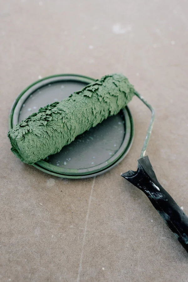
Photo by La Miko from Pexels
WHITES & NEUTRALS
The 20 best shades of white - Laurel Bern is an interior designer and paint expert and has written numerous posts on paint selection. If nothing else, read it for her comparison of picking the right white paint to picking the right husband - hilarious!
Four Best Whites for Your Open Plan House by color expert Maria Killam.
The best warm gray paint colors - Life on Virginia Street’s post is a good reference since 50 Shades is only the tip of the Gray iceberg.
Best gray & greige paint colors - Kylie M. Interiors paint color blog.
The only 6 white paint trim colors you’ll need - Laurel Bern.
Ask Maria: What’s Next After the Grey Trend? - a great one to read about treading carefully around color trends in general.
POPULAR NEUTRAL PAINT COLORS:


Non-neutral colors
First, neutral and color aren’t mutually exclusive.
Case in point: my living room is painted Benjamin Moore’s Richmond Gray, which is more of a neutral green than gray. Similarly my dining room is painted Ben Moore’s Sea Haze, which is a medium neutral blue. (see images below) You don’t have to choose between neutral and color if you don’t want to!
In fact, when you think you want color, I’d strongly advise you to sample the color on the chip that looks like it doesn’t have enough color. 8 times out of 10, it will produce all the color you want once up on the walls, and sometimes more than you want.
Most of the time, when people think they want “color,” what they actually want looks muuuch more neutral on the paint swatch and even on a large painted sample than the reality of the entire room painted in that color when the sun hits it directly.
Again, this is advice based on painful and expensive experience. Allow me to illustrate using Benjamin Moore’s Sea Haze 2137-50:

Benjamin Moore’s Sea Haze is on the wall behind the buffet. Gargoyle 1546 is on the left wall (more about Gargoyle later). Feather Down OC-6 on the trim and china hutch.

This is why paint color selection isn’t easy and you can’t go off the chip! Doesn’t the Benjamin Moore Sea Haze appear much more gray on the swatch than when it’s painted on the walls?
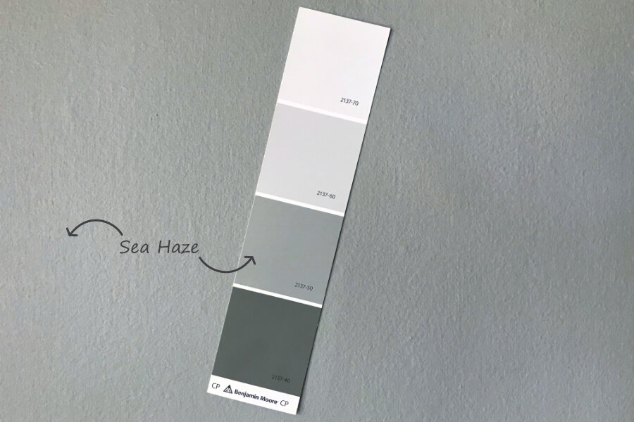
Holding the same chip against the wall, it’s a near perfect match. Sea Haze appears slightly less blue in reality than it does in the dining room image above, but it goes to show that the chip alone doesn’t tell the whole story.
SHOP THE LOOK


Here are some additional resources:
No-fail paint palettes - Laurel Bern with several “neutral colors” included
Help! My Light Gray Walls Turned Baby Blue - Maria Killam. I totally resemble…
Best blue gray paint colors" - Life on Virginia Street
Most popular blue and green paint colors (with gray blends) - Kylie M. Interiors
How to select the perfect color scheme - Laurel Bern, features some saturated color options
Also, search for best (white, gray, green etc) paint colors on Pinterest and you’ll get some good recommendations for paint selection starting points. Look for cross-references with other recommendations for added confidence.
Perhaps you’re like me and you don’t dream in shades of beige or white. You want a neutral with a subtle undertone of a color.
I’m not going to lie to you though, this can get tricky (and expensive) fast. What appears on a paint color swatch to be the most subtle warm gray can be not so subtle lavender gray once it’s up all over the walls, especially where the corners intersect or where light hits it directly causing underlying tones to “glow” (not in a a good way). For more on this, read on:
Paint selection case study: stairwell and office
I just finished having my back stairs and soon-to-be-office painted. It looks great, but the road getting there was rocky and expensive.
I’ve gone through this before with picking paint, and this project’s shenanigans were the final straw. As a result, I’ve come to some key conclusions:
Paint can look VASTLY different according to what other color is around it.
Paint MUST be sampled against a white background.
The “sum” of paint color is greater than it’s parts. You can paint large separate samples in 5 different places (as I did) but until it’s up floor to ceiling as a big section including corners (where it reflects on itself) and the sun hits it, you may not be able to see any undesirable colored undertones if it has any.
I’m not proclaiming any paint break-through here, but I am going to emphasize the importance of this, especially when working in a space that gets a lot of direct sun.
I will never test paint on a colored background again, nor will I rely on anything other than a sample that includes a corner intersection.
I admit that for this project, I didn’t do anything the right order. I had a loose idea in my head of what I wanted for my office, and thought I wanted a deep gray for the stairwell, but didn’t put together a mood board or cohesive plan until it became apparent part-way through I needed to. (See how to create a mood board for interior design.)

Stairwell
I was 75% set on a deep gray stairwell that goes from the kitchen and back of the house into the garden, but not positive. After purchasing samples, I applied them straight onto the existing paint in about 3 or so locations.
I could tell the existing Martha Stewart Shortbread paint (a warm beige) was skewing how the samples looked, giving them an odd blueish-gray cast, but I was in a rush and decided to go with what I thought was a fail-safe color, Stonington Gray.
I’ve tried sampling paint on Shortbread before in my dining room years ago with disastrous results and more than one re-paint of that room, yet some how I thought it would be different this time. As if.
Boys and I left for the weekend and came back to a gray that was way too lavender when the south-facing stairwell hit direct sun. Had this been a dark stairwell with indirect light, it would have been quite nice, but here it had too much “lavender glow.”

Stonington Gray looks fine in this image - the day had turned overcast and so the image doesn’t pick up the lavender. Many have had success with this color, so it just goes to show that testing paint samples the right way and in your own particular setting is crucial. In reality though, with the sun hitting it, everyone agreed that it was a lavender-gray and not what I wanted.
Stairwell Round 2:
So I had to come up with a new color, buy new paint and pay to have it repainted. Yay.
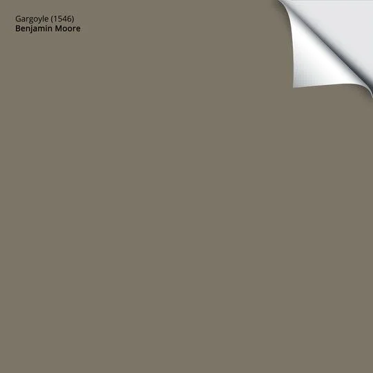
Benjamin Moore’s Gargoyle 1546 is a soft yet deep gray with green undertones I already have on a wall that is mostly taken up by an off-white built-in china hutch painted in BM Feather Down. (Scroll back up to the dining room image.)
I knew I wanted a dark gray in my stairwell, but I definitely didn’t want 50 shades of gray or anything else in my house.
So why didn’t I just go color-shopping in my own home and avoid the costly first round? Well I did initially, but against the Martha Stewart Shortbread color on my stairs, I looked at the Gargoyle and said “Ick!” (and so did my son, just for the record) and then proceeded with Stonington Gray, which both I and my painters thought was fool-proof.

Various shades of light and dark gray on a beige existing paint color which gives everything an inaccurate sickly-bluish/gray cast.
Under pressure to quickly make a new choice when the Stonington Gray failed though, I looked at my dining room wall where the Gargoyle looks great, and decided to ignore my memory of what it looked like sampled against Martha’s Shortbread.
It’s also worth noting that these two spaces both face south, so the light isn’t that different, although the stairwell is darker.
Here’s the end result - Benjamin Moore’s Gargoyle 1546. It’s exactly the rich, dark gray I wanted.

Benjamin Moore Gargoyle 1546, and yes, that’s honest to goodness, original shiplap. (Does that mean I have a Spanish Modern-Farmhouse style home?!)
Office
The office walls had to be resurfaced so they were coated in primer when I went to choose the wall color. I decided to go with Benjamin Moore Barren Plains because I had painted 5 large samples and thought it looked like a perfect soft earthy warm gray.
I was concerned though because on the swatch, it’s the next lighter shade above Stonington Gray, and I had already had my lavender moment with that. But the samples looked so great, I thought “It can’t possibly go lavender!”
I was then shocked to see my nice earthy gray Barren Plains somehow go lavender once it was up all over. However, this room is literally all south-facing windows and is flooded with light, so if any paint has an undertone, it’s going to show up in this space.
I tried to convince myself it was just me being overly picky though, so I said to my son “Go into the room, come back and tell me what color you see.” (No leading questions like “Does it look lavender to you?”) He reported back with “It’s a lavender-ish gray.” Out of the mouths of babes (or 14 year olds.) Undeniable.

Different Benjamin Moore gray samples on white primer including Seattle Mist, Northern Cliffs, Revere Pewter, Barren Plains, and Feather Down trim. Barren Plains looks perfect here but turned lavender-gray once painted over the entire room. Note how dark and yellowish the Feather Down looks next to the primer. It looks great once the real color is applied.
So this time, I *cleverly* thought instead of paying for a whole new set of paint at $55/gallon for the Ben Moore Regal line, I’ll see if they can knock down the lavender so I could salvage the last 1 of 2 gallons. They obliged and added a drop of black and green to knock out any red causing lavender. See the result below.

You can’t tell from the image, but Barren Plains went lavender-gray (as did Stonington Gray which is one level below it on the swatch in my stair well). So the paint store tried putting 1 drop of black and 1 drop of green in the second gallon, causing it to go blue, so it was again back to the drawing board.
Note how much lighter and brighter the Feather Down trim looks now that it’s not sitting next to the ultra-white primer as seen in the image above.
The end result was a rather nice pale blue gray, but was not what I wanted, so back to the drawing board.
Office Round 2: I resisted choosing one of the commonly recommended grays just because it’s my nature to want to find a unique choice. (Same reason I have a mental compulsion to change up any recipe I use and “make it my own” for better or worse...)
Ben Moore’s Revere Pewter had been recommended by so many designers though as an appealing warm gray with no weird undertones, it was my second choice anyway, and I was fed up with myself and the whole process.
Two more gallons purchased and up went the Revere Pewter and I love it. It’s a lovely soft pale warm gray. As I said though, this room is literally all south-facing windows, so Revere Pewter would appear more medium-gray on a room with less light.

Revere Pewter HC-172, one of Benjamin Moore’s most popular warm gray colors. Feather Down 953 trim, and Acadia White OC-38 ceiling. Note how much lighter both Revere Pewter and Feather Down appear here compared to the white primer image above.
Trim: The Feather Down trim color looked very creamy-dirty next to the primer white in my office which had me freaked out. So I marched into my other rooms where its used. It looks like a nice off-white and not too dark or yellowish at all. Still, I wondered if it was going to somehow appear different in the office. It looks the same as the other rooms and is beautiful now that the actual wall paint is up.
I do want to say I think both Stonington Gray and Barren Plains would look great in a north-facing room or in a northern climate with cooler light - the touch of red that creates the lavender undertones would warm up the gray nicely in such a setting or if you wanted that kind of undertone to begin with.
(Btw - If you want to see how the office turned out, check out the Greenhouse Studio Home Office Reveal.)
SHOP THE LOOK


Paint-picking strategy recap
Neutrals
Tried and true designer recommendations exist for a reason! Save yourself hassle and try one of them instead of winging it if the shade is in the ballpark of what you want!
Painting on anything other than white won’t give you an accurate representation. Even then, primer white can skew your notion of light and dark. (Remember how yellow-dark the Feather Down trim color looked next to it?)
At a minimum, paint or Samplize onto large, white poster board or a piece of drywall purchased at the hardware store (for more accurate texture).
Neutral Color and Saturated Color
If you are going for any sort of “neutral color” or stronger, OR if you have concerns about undertones in any neutral, I recommend putting primer up on a wall and then applying a large section of your test color including corners and in an area where the wall gets direct sun.
Get your money’s worth out of your Samplize or tester quart! (And save yourself a lot of money and aggravation later by getting it right the first time.)

Even the palest of these paint chips will have a lot of color once painted everywhere. Always choose the paint chip that looks less colorful than you think you want. Then thoroughly test it on your walls before committing. Image by KoalaParkLaundromat from Pixabay
Paint color will look more color-saturated on an entire wall than on the swatch or small sample.
In other words, if you desire a hint of lavender to warm up your mostly gray paint choice, your paint swatch that looks like a nice subtle warm gray might look a lot more like a purple Barney nightmare when covering an entire wall. ALWAYS do a large sample against a white background including corners.
The “sum” of paint color is greater than it’s parts. You can paint large separate samples in 5 different places (as I did) but until it’s up floor to ceiling as a big section including corners (where it reflects on itself) and the sun hits it, you may not be able to see any undesirable colored undertones if it has any.
Watch how the paint looks at different times of the day and with artificial light.
OK so that’s my paint saga and my recommendations on how to choose paint colors. I’ve been through this more than once over the years, so I wanted to get it all out there - it was kind of cathartic!
What about you? Has your road to paint selection been smooth and easy (if so I envy you!) or have you had any mishaps yourself?
[Want more design inspo and helpful plant tips? Let's hang out on Instagram!]
Was this post helpful? Pin it for later!