Pasadena Showcase House
If you love a house tour and you’re in the L.A. area during spring, Pasadena’s Showcase House is not to be missed. In fact, the city of Pasadena isn’t to be missed, and I’d recommend sticking around for another day or so to see other sights while you’re there.
I lived in Pasadena in the early 2000s while in landscape architecture grad school, and my sister moved there about the same time and still lives in South Pas with her family. So my mom, sister, and I have been doing the Pasadena Showcase House for years, always making it a girl’s weekend.
After a two year hiatus, we were glad to be back, and the 2022 showcase house did not disappoint.
Pasadena Architecture & Design
Pasadena is part of Los Angeles which is often known for chasing the latest shiny thing more so than historic architecture and design. This makes Pasadena kind of an L.A. anomaly since it’s a city with miles of gorgeous historic register neighborhoods and architecturally significant civic and commercial buildings. Although for much of America, Pasadena’s main claim to fame is being the host of the annual New Years Tournament of Roses parade and Rose bowl football game.
The Pasadena area which includes Pasadena, South Pasadena, and San Marino, is a gold mine of early twentieth-century architecture. California Arts & Crafts and Spanish Colonial Revival are the stand-out architecture styles, but others include Tudor and Norman revival, which are based on a 20th century interpretation of English historic periods.
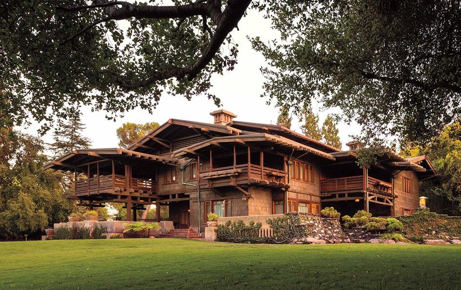
The Gamble House, designed by the Greene brothers. Visit Pasadena
Pasadena was a location of choice for many early 20th century industry titans hailing from the East Coast and the Mid West who wanted to enjoy the fruits of their labors in a warm climate. This legacy includes the Huntington Museum, Library and Gardens (built by the railroad baron), the Gamble House - an Arts & Crafts masterpiece designed for the founder of Gamble & Gamble, the Wrigley Mansion’s Tournament of Roses parade headquarters, (you guessed it - chewing gum fame) and the Langham Huntington Hotel, each of which are situated in some of the most beautiful residential neighborhoods you’ll encounter.
The Langham Huntington Hotel, Pasadena set against the San Gabriel Mountains. Wikipedia
Campuses include Cal Tech (Big Bang Theory TV show’s inspiration) and the ArtCenter College of Design, plus miles of historic-registered neighborhoods filled with endless architectural and garden inspiration like Bungalow Heaven and the Arroyo which is surrounds the Rose Bowl, home to the famous Rose Bowl Flea Market, so there’s a lot to see for a design enthusiast.
1905 S. Pasadena Tudor Revival Showcase House
This year’s home was a sprawling Tudor revival in South Pasadena named Oaklawn built originally in 1905 for Mr. Harry Hawgood, an English civil engineer (and a successful one at that apparently :).
It’s located in a gorgeous Greene & Greene designed neighborhood. (The Greene brothers were a main force behind the early 20th century California Arts & Crafts movement.)
Oaklawn Manor, a 1905 Tudor revival within a historic Greene & Greene planned neighborhood in South Pasadena.
Unfortunately I don’t have images of all the rooms since my iPhone photography abilities broke down here and there, but I do have more on Instagram.
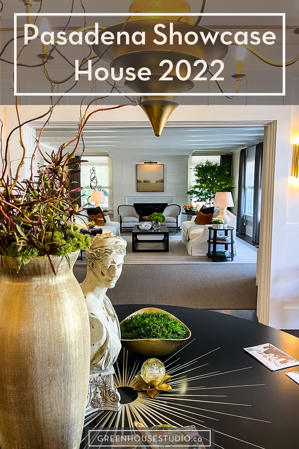
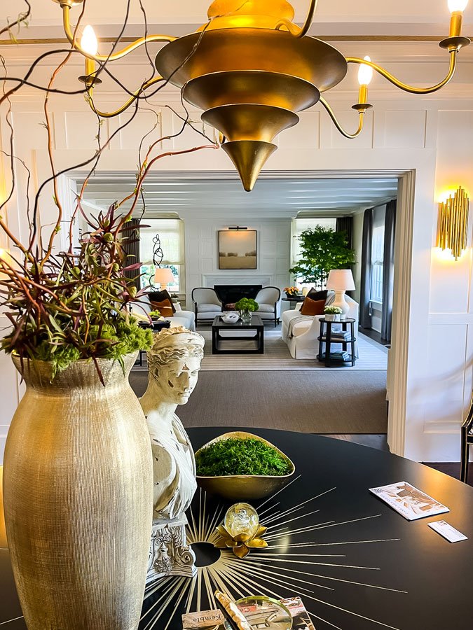
Here’s a view from the entry looking towards the living room:
The entryway designed by Pamela Sandall Design looking into a living room designed by Robert Frank Interiors.
Here’s a close up of the fireplace in the living room. Robert Frank used a few of these landscapes which I really liked.
I loved seeing the ceramic fireplace balls used indoors. They’re a great look for gas fireplaces either indoors or for an outdoor fireplace or patio firepit. They sit on a burner pan and you can stack the balls however you want. When you fire up the gas, the flame pops through the voids in the balls, creating a chic and modern alternative to fireplace logs.
Living room fireplace close up, designed by Robert Frank Interiors.
We moved from the living room into the library. I loved this pop of poppy (#sorrynotsorry) in the otherwise dark and dramatic library. Plus don’t miss the ceiling.
Library designed by Stephanie Hatten Interiors.
This staircase painting over the library bookcase is fabulous - I kept taking pictures of it. Paring the dark paint with the lighter blue-greens isn’t a combo you always see, but I thought it was gorgeous - soothing yet dramatic at the same time!
Dark bookcases and wood paneling paired with blue-greens. Stephanie Hatten Interiors.
I really love library/media rooms. There’s something about these dark and dramatic spaces that just works for me. (So much so that I designed my own a while back.) This one upped the ante though by including a beautiful bar.
Library bar with a leathered marble surface. Stephanie Hatten Interiors.
I’m kind of obsessed with vignettes like the one below. A nice coffee table book or two and vase (source at thrift stores) with a bit of greenery from the back yard, and you’re set!
The orb vase with a bit of asparagus fern on the book looks perfect. Stephanie Hatten Interiors.
Pasadena Showcase has an official paint palette every year and this year’s came from Dunn Edwards. (Maybe it’s always Dunn Edwards - I’m not sure.) Here’s the family room which used Dunn Edwards Black Bay paint like the library before it.
I love this small mid-century Asian-inspired sofa. Years ago I hauled home a similar one from Goodwill with big plans of re-upholstering it. Then I learned how expensive reupholstering can be and parked it on the curb with a “FREE” sign.
The family room was also done with sophisticated and cozy neutrals and was a harmonious transition from the library. I also love accessories here. Tocco Finale
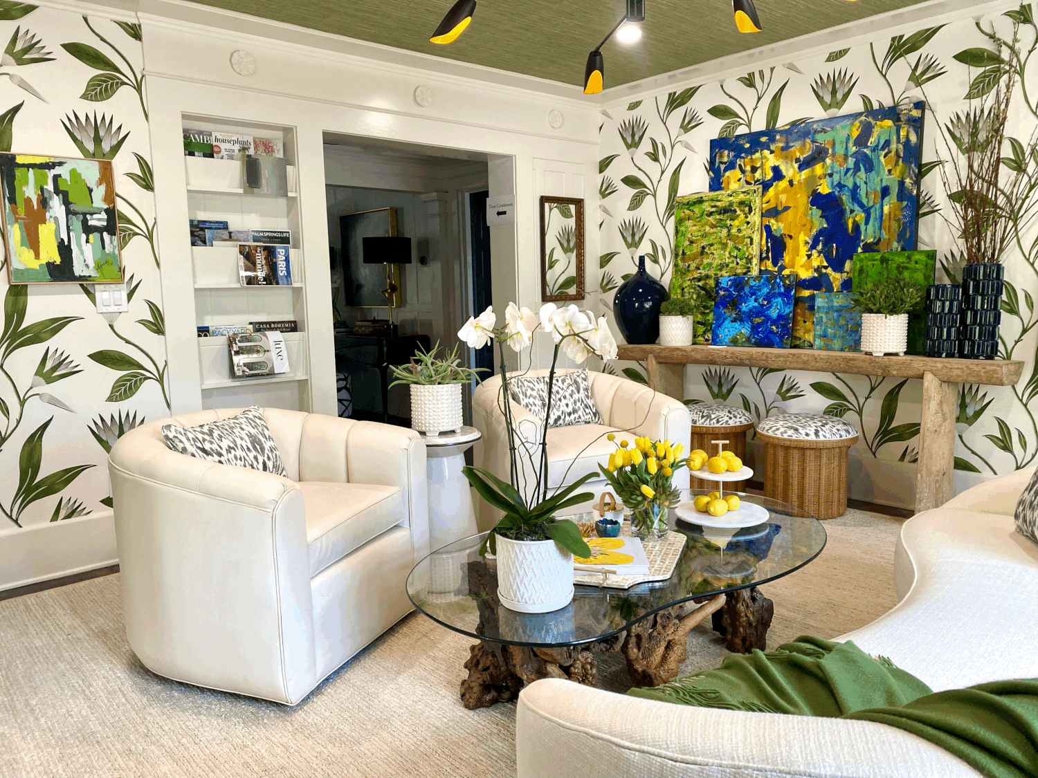
Here’s the sunroom done in neutral white and green with yellow and blue accents. I like the modern black pendant peeking down mixes with the organic shapes and botanicals.
The sunroom has a scaled up botanical wallpaper with a grass cloth papered ceiling. James Hernandez Interior Design Inc.
Here’s a cheerful vignette on a cocktail table in the sunroom. James Hernandez Interior Design Inc.
Below are images I captured here and there throughout. Again, I wish I had managed to get postable imagery of every room, but easier said than done. Take a look and enjoy:
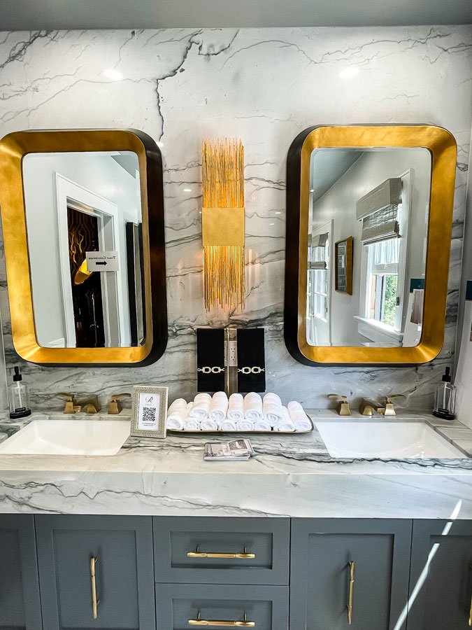
Here’s my attempt at capturing a glamourous primary bath. The gold/brass really pops next to the gray cabinetry and stone. Interiors by Ranalli
The Primary Bath marble tile inspired me for my own future bathroom remodel. Even the drain is lovely. Also, I really want those shells that look like they’re made from terra cotta. Interiors by Ranalli
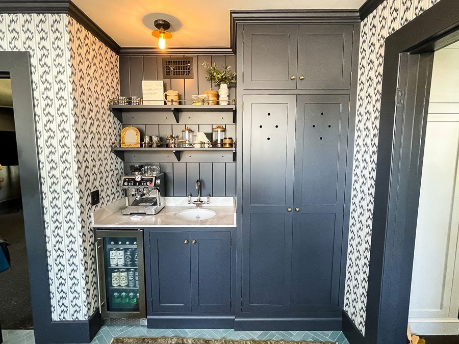
The laundry room has beautiful wallpaper with dark cabinetry. It also had the most clever drawer-hidden ironing board which you can check out as a reel on my other Instagram account, Scaled Up Studio.
Laundry room by Denise Bosley Interiors
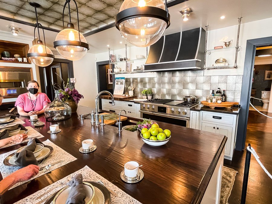
The kitchen was spacious yet warm with the mix of metal and wood. The hand-planed walnut on the island is lovely. The Monogram range has mixed metals and a dramatic hood Also note the dark trim paint. Cozy Stylish Chic
Everything about this kitchen corner - the dark veined stone, the extra-wide pulls, the bronze-trimmed uppers, and the microwave situated down low works for me. Cozy Stylish Chic
I’d happily move into the pool cabana too. The warm wood (warm wood tones & palettes are back in a big way!) next to the sage greens and whites is soothing and beautiful. The Art of Room Design
If you look carefully you’ll see the sage green wallpaper of the pool house dressing room coordinates with the indigo and sage throw pillows in the previous image. The Art of Room Design
This neutral tones of the wood Chinese style credenza in the dressing area looks great next to the sage green wallpaper. The Art of Room Design
This being Greenhouse Studio and all, you knew there would have to be a fabulous plant somewhere. I spotted this ginormous staghorn fern when were walking out. I’d love to know how old it is.
Large staghorn fern, Platycerium bifurcatum, thriving outside at the Pasadena Showcase House.
A back view of the Tudor style home with mullioned windows, a large California oak tree, and a new pond-like water feature. California Waterscapes
I hope this year’s Pasadena showcase house inspired you. What did you like best? What are some of your own favorite sources for new interior design and architectural inspiration? Leave a comment below.
Enjoy the post? Pin it for later!
If you have any questions or comments, please drop me a note below. Be sure to check back for my response (I always respond) since no notification is sent.
XO,
Tina

